Quantifying Change: A Guide to the PixElement Timeline Feature
In construction, mining, and other industries, a single snapshot of a site is rarely enough to tell the full story. Project managers and site foremen need to understand how the site is evolving in time, whether that means tracking earth-moving progress or monitoring fluctuations in raw material inventory.
To address this need, we have introduced the Timeline feature, currently available exclusively within the StockpileStudio module. This tool allows users to view and compare multiple datasets of the same site taken at different times, providing a clear visual and analytical history of site progression.
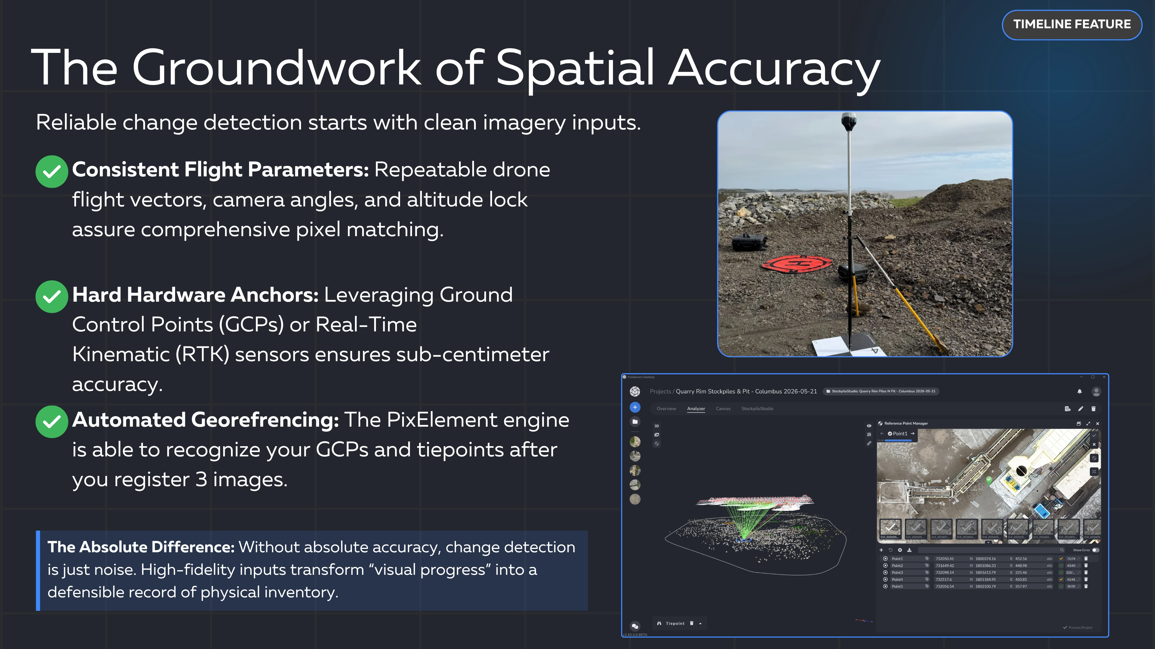
IMPORTANT: Please be sure to use the same tiepoints/GCPs for all comparison projects. This allows the models to be properly aligned and compared against each other. If they are not properly aligned, the models will be subject to elevation errors.
Accessing the Timeline Viewer
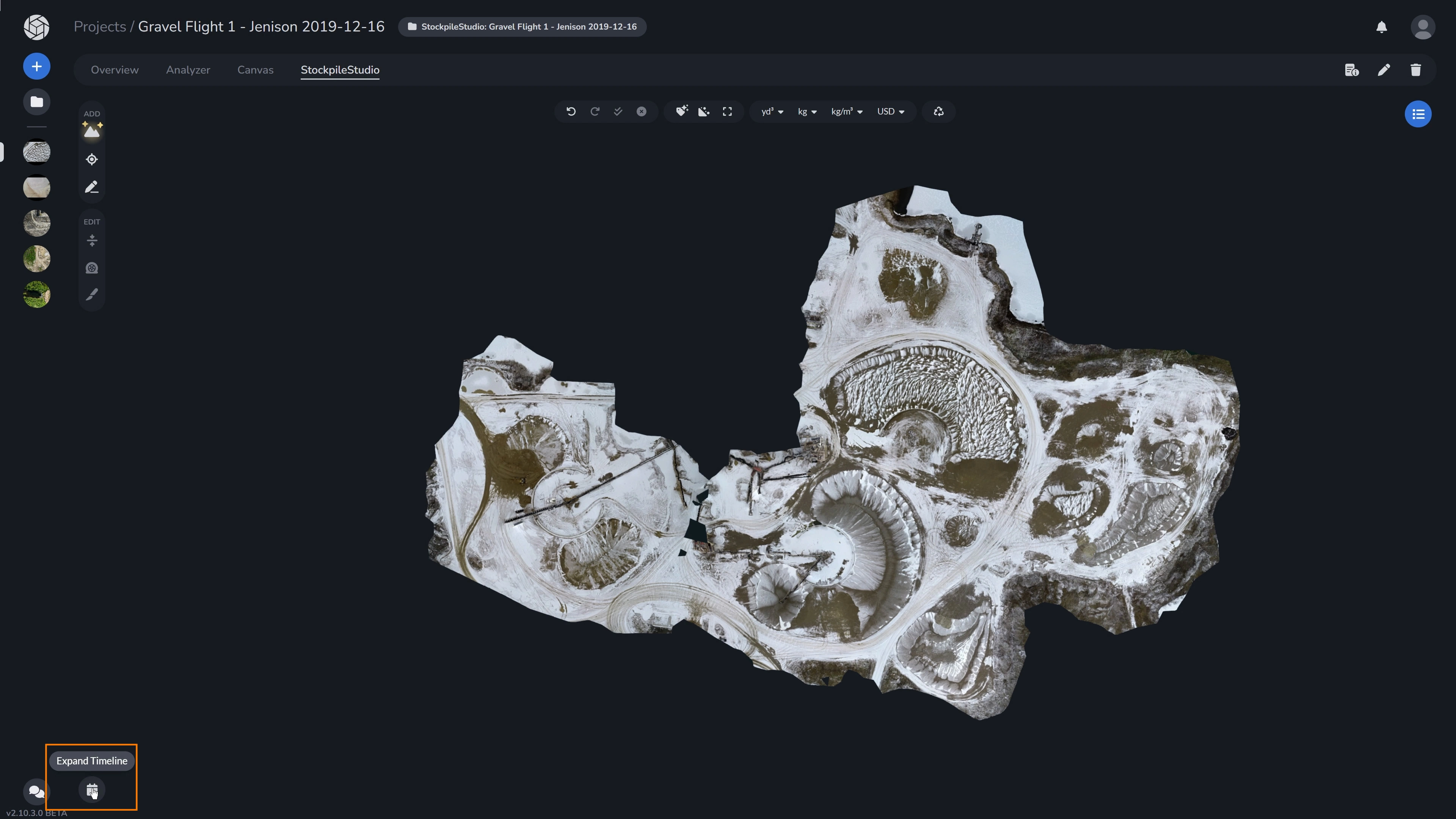
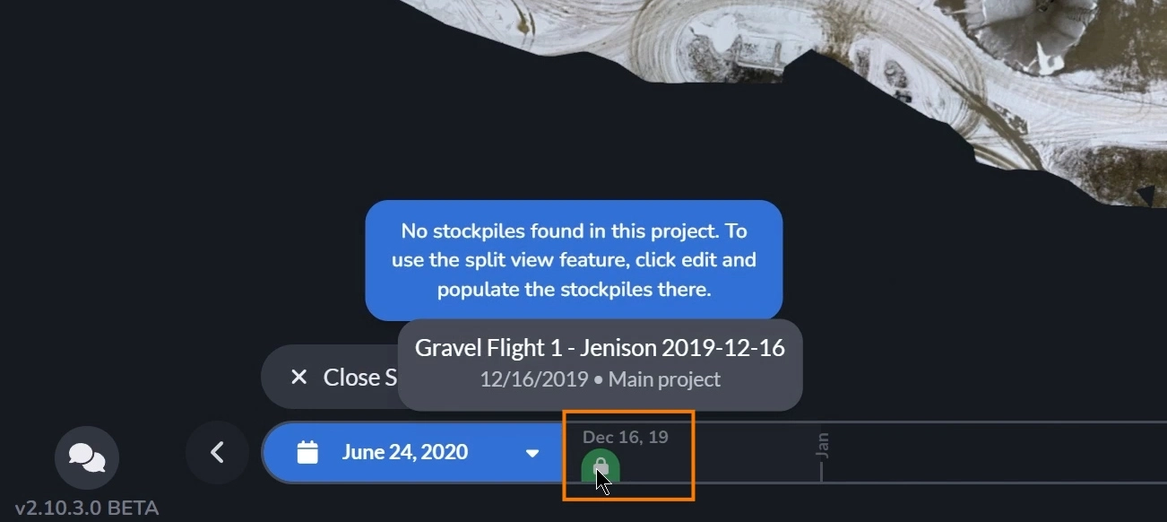
Within the StockpileStudio canvas, navigate to the Expand Timeline icon down in the left hand corner. This interface allows you to select from a list of available survey dates. Click Choose a Project and select the project date you would like to compare your open project with in the dropdown. You can also click on the specific project on the timeline. You may also hover over each project’s marker to view the full project name, date collected, and how many days it has been to your base project’s (the project you currently have open) collection.
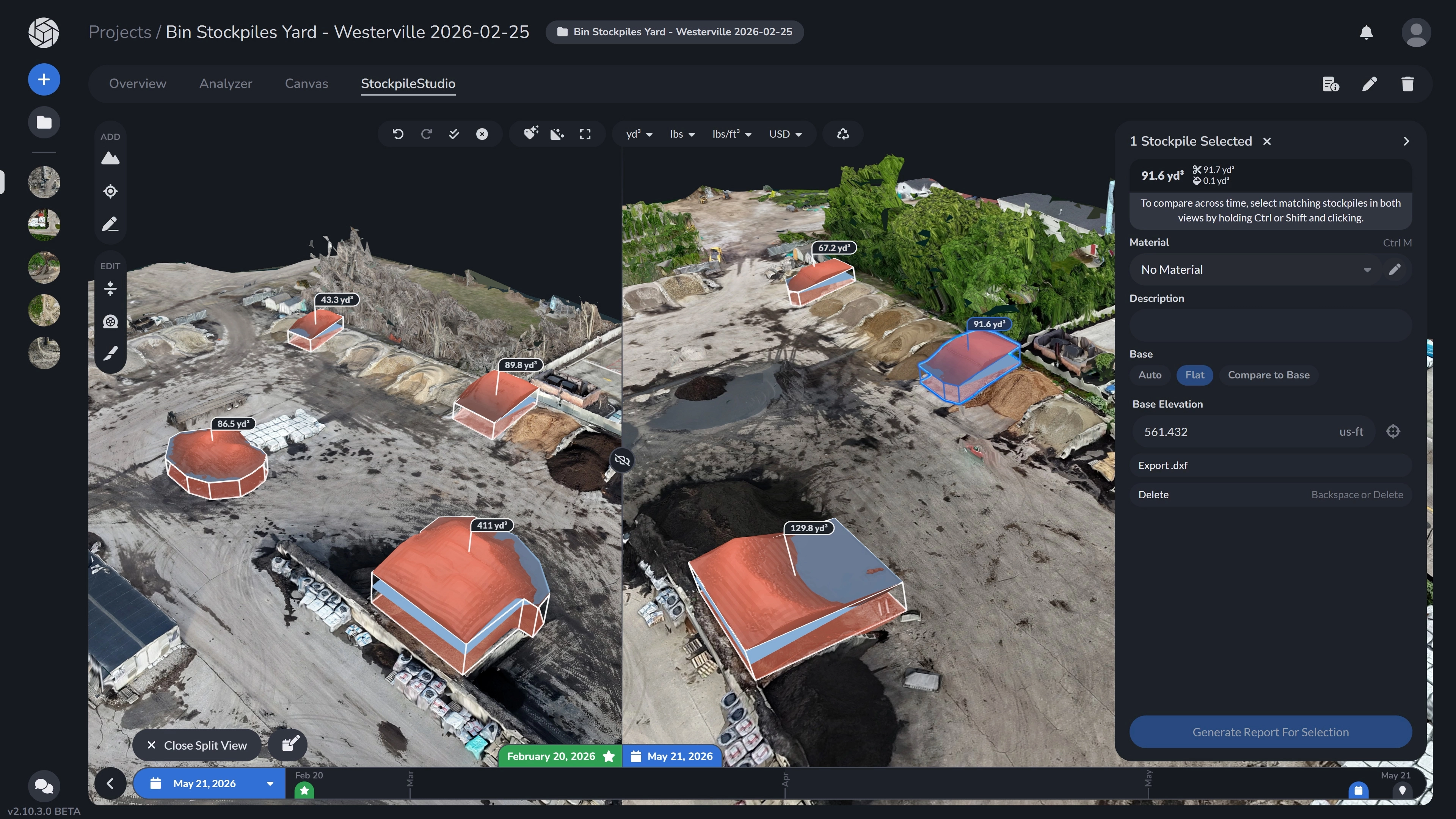
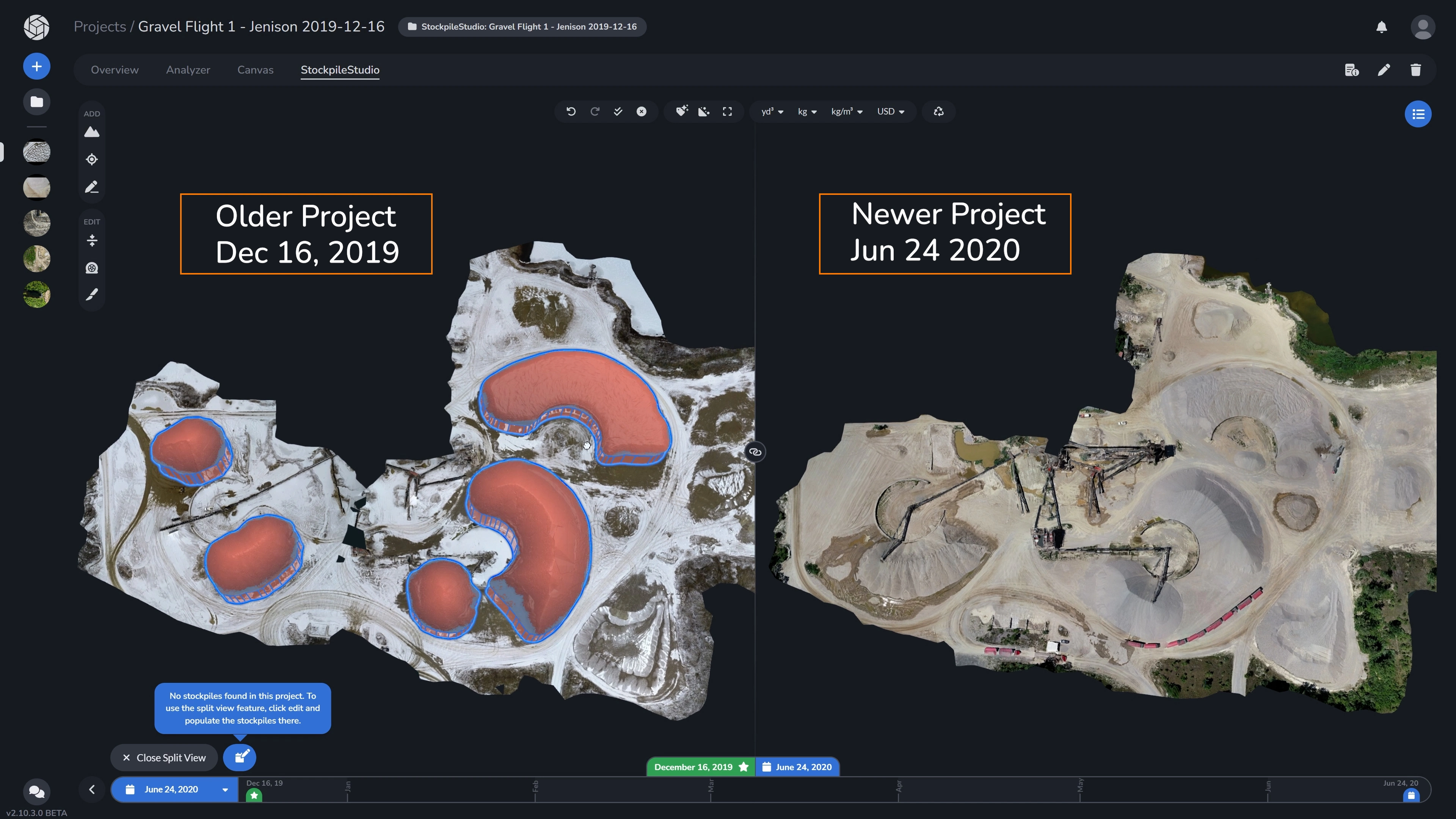
Once the project loads, you will have a split screen comparing the two projects. While previous projects are expected to have stockpiles already populated by default in the expected workflow, if stockpiles are not detected in either project, you will be prompted to add them. For the project you currently have open (the base project), you can go straight to the ADD tools on the left and add your stockpiles. To add stockpiles to the comparison project, you must open the project as your base project. You can quickly do so by clicking the edit button down below the popup, or by clicking the “click here” link in the comparison project’s message. This is also the same rule when it comes to using the Inspection Panel for editing materials and generating a report of your selections.
Understanding the Split Screen:
The split screen clearly defines the role of each dataset based on its position and color.
When comparing two datasets, the split screen will always display the older dataset on the left, and the more recent dataset that you have selected on the right, providing a clear visual progression.
The green labeled dataset with a star icon will always be the base project (the current project that you currently have opened), and the blue labeled dataset with a calendar icon is the comparison project.
Comparing Side-by-Side
By default, as you pan or zoom in one window, the historical window remains synced, allowing for a precise look at how specific features have changed between survey dates. Click on the Sync Cameras button to sync or un-sync camera movements in the two windows. You are also able to drag the split screen further onto either side to your liking.
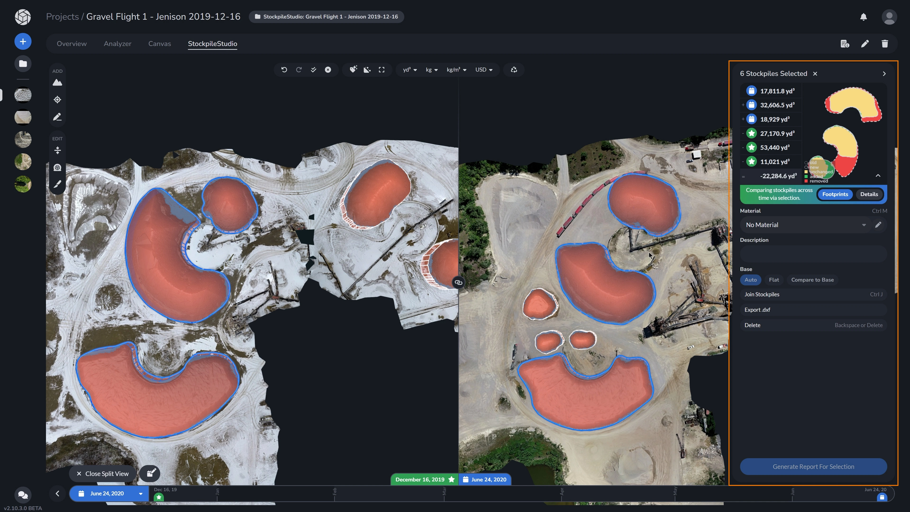
4. Quantifying Movement and Volume
While visual comparison is valuable, the true power of StockpileStudio lies in quantifying changes over time.
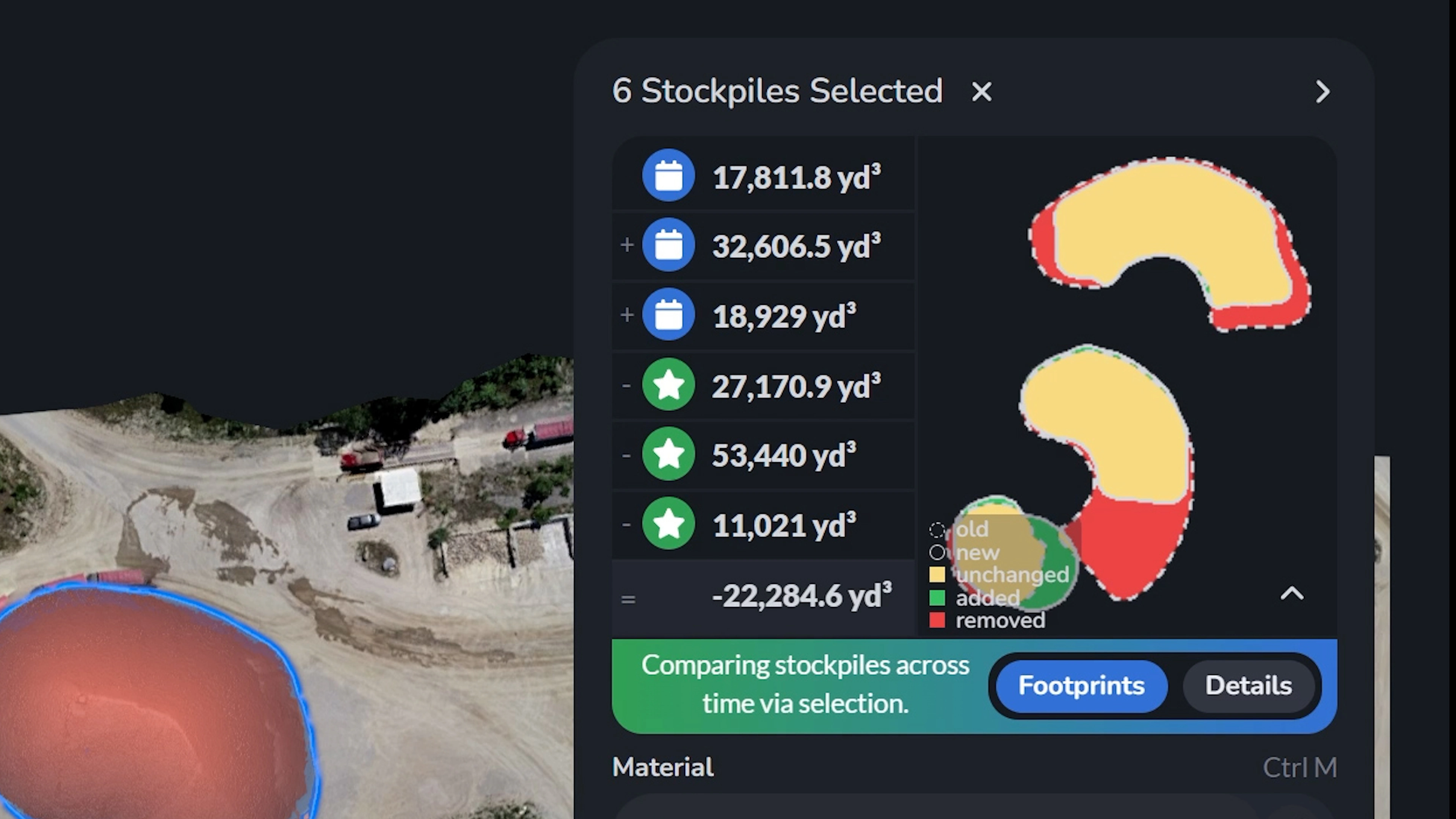
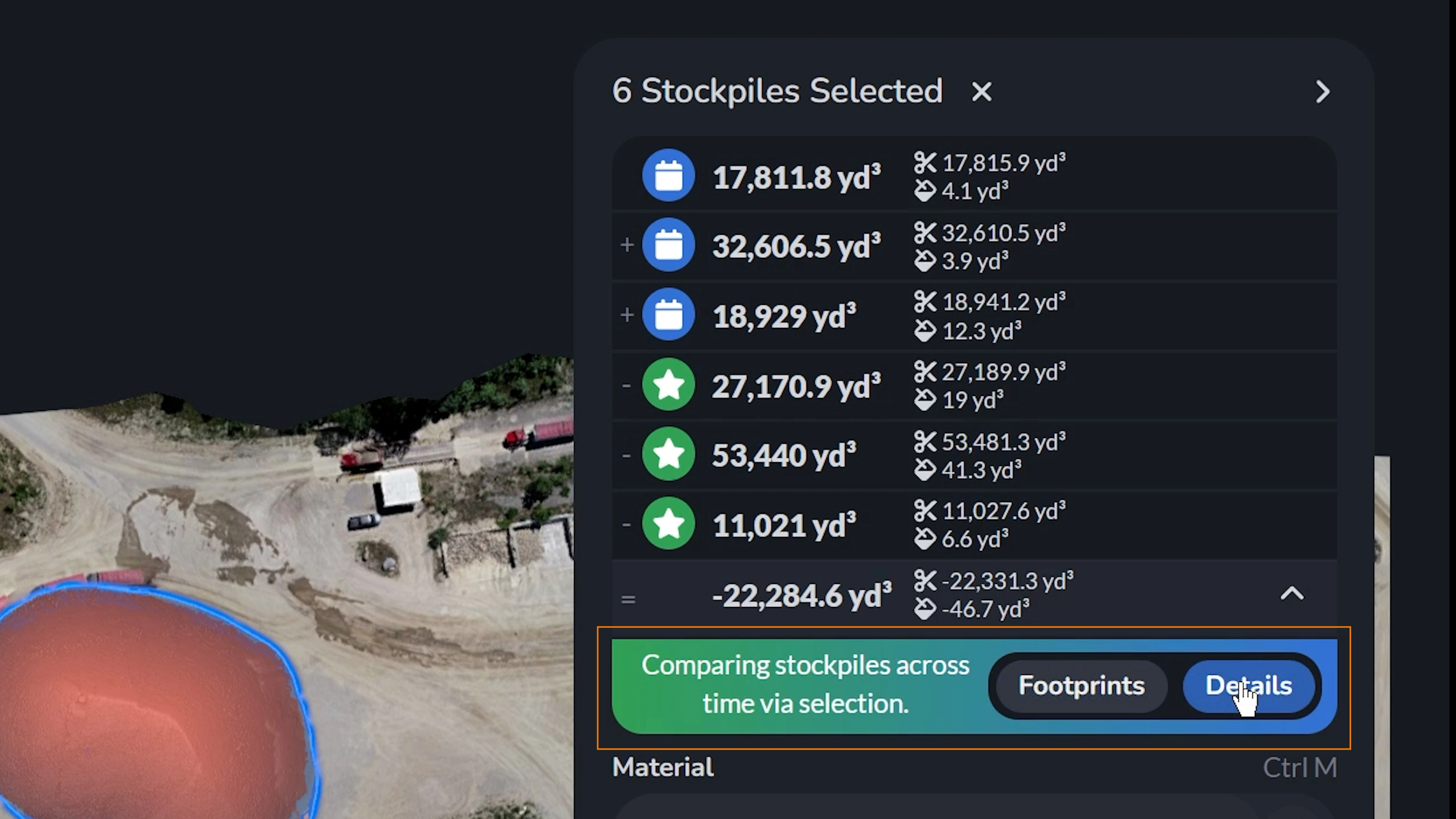
To compare two or more stockpiles between projects, select your stockpiles in either of the projects by holding shift. Upon opening the Inspection Panel, you will be able to see a direct volumetric comparison and a detailed footprint analysis between the two datasets.
Specifically, the comparison panel provides:
- Volumetric Breakdown: The exact volume of the stockpile from your current timeline (indicated by the green star icon) alongside the historical volume from your comparison date (the blue calendar icon).
- Net Change: The system automatically calculates the net difference between the two surveys, showing exactly how much material was added or removed in cubic yards (yd³).
- Footprint Analysis: A color-coded, top-down diagram that visually categorizes the spatial changes. The legend clearly highlights exactly where material was added, removed, or left unchanged across the overlapping footprints.
- Customizable Views: Quick toggles allow you to switch between the visual “Footprints” map and the hard numerical “Details” depending on your reporting needs.
Currently, users are only able to export respective volume reports for the dataset they have open, just like normal, in StockpileStudio. Comparison report exports are in development.
If you’re looking to track inventories through time in an automated, powerful fashion, give StockpileStudio Timeline a try!